Brainstorm
0 Comments
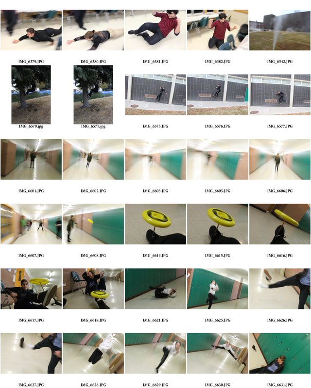
 At first, as seen in the first few, my partner and I struggled with when the shutter timer started, so our first few did not accomplish the drawings we intended. Later, however, we found great success when we pulled up a different colored image and created what looks almost like a vortex, which was exciting. This helped me to learn how line and space are very important elements in creating a successful light painting.   My top 10 are: 6126, 4349, 4339, 4320, 4311, 4299, 4308, 4270, 4266, and 4252 because they show emphasis, through lighting, on certain aspects of places I like to spend time.
4270 best shows rule of thirds because the two poles that hold up the roof line up perfectly with the grid and the tables I focused on stay in the bottom third for the most part. My favorite art element is space because it is often underestimated. My favorite principle of design is balance because it is what makes a photograph well rounded.  To me utopia always has a connotation of unobtainable. Instead I prefer to view it as a receding goal-line that we always strive to be better. One of the ways I would improve the world would be to add a level of transparency to our very rigid society. Some of the most prejudice people are that way because of Ignorance. If everyone and everything were more transparent, knowing would become less exclusive and more inclusive. In this unit I practiced the rule of thirds, compositionally, keeping my color, shape, space, and texture all very intentional. I glued my lowest layers on first to fill all the white within my boarders before depicting the main cube. I intentionally left the pencil lines I used to create my 2 inch boarder because I felt they made the boarder attached to this piece in a way a blank border could not. It creates similar sized shapes top & bottom, left & right, which adds to the rigidity I intended to convey. I believe the strongest part of my work was my use of space, while my colors still looked a lot like the magazines I took them from. Next time I might try more of a mosaic style with my background, using square and rectangle shaped pieces to continue to convey that rigidity.
|
| Miles Art Portfolio | Daily Assignments |